
The London Underground in a multi-screen world
Harry Beck was a London Underground employee who, basically, decided that the physical locations of the mostly underground stations were irrelevant to travelers of the day whose main desire is to know how to get to one station from another. It was the topology of the railway mattered. His uncommissioned idea was make clearer design which would emphasise connections by differentiating between ordinary stations and interchange stations. At the time, in 1933, Beck was paid five guineas for his spare time project. While he continued to modify the map, his final design, in 1960, bears a strong resemblance to what we know today as the modern-day map.

Basing his original design electric circuit diagrams, Beck created the map using straight line segments with the River Thames as a guide where lines ran only vertically, horizontally, or at 45 degree diagonals. Unfortunately, next time you’re on the Tube, you’ll quickly realize you aren’t going in a straight line.
Fast forward to the 21st Century and the smartphone
Unfortunately, there’s no way Harry Beck could have known back in 1933 that his initial design of the London Underground map wouldn’t translate to a smartphone. According to research by NYU professor Zhan Gao, 30% of travelers choose the wrong route on the current London Tube map because of this. Enter designer, Mark Noad and his updated design concept that combines geographical accuracy, visual simplicity and usability updates. What a concept.

Noad said: “I’ve always taken the Tube Map for granted. As a designer, I’ve listened with interest to friends from outside London and overseas saying how confusing they find it especially when trying to relate to London at street level. So I wondered what Beck would do asked to start again with the different parameters we have today.”
Unfortunately, this seems to have sparked an odd controversy amongst designers as to how design and usefulness should be interchangeable….and, are they?. The furor continues with a debate over whether or not designs are created for “designers” or the end-users. Maybe it’s because I’m a user and not a designer, but I’m going have to side with the end-user here in the case of the Tube map.
In his defense, Noad doesn’t claim that the map he has created is better than the original and it is not intended as a replacement. He also feels that Harry Beck’s original design is one of the greatest designs of the 20th century but, in the end, doesn’t believe Beck would have been happy to put his name to the current version. If you want to check out the beta test site for the Noad’s new design, click here. Would love to know what you think.
Why does this all remind me of the Monty Python Argument Clinic sketch…
http://www.youtube.com/watch?v=kQFKtI6gn9Y
In: Comedy,Locations,Odds & Sods
Related Posts
 150 years of 'Minding the Gap' on the London Underground
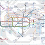 Ever wondered what the Oxford Circus tube station tastes like?
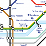 London Underground Tube Map gets Shakespearian makeover for 400th
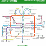 A Festive Tube Map just in time for the holidays!
 In need of a pint after seeing a ghost in the Underground? Try a haunted pub!
 Doctor Who by Tube anyone?