BBC 3 headed to online only in February 2016 with a very ‘W1A’ looking logo
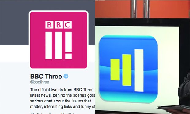
With the 16 February shuttering of what ‘we call’ BBC3, the powers that be have unveiled a new logo that all-too closely resembles a redesign of the BBC logo created in the BBC parody comedy series, W1A, where a ‘new 21st century look’ was pitched to the Corporation by Jessica Hynes’ nightmarish Head of Brand Siobhan Sharpe. The real logo was unveiled recently as the new visual identity across the BBC Three platforms, the TV channel, the BBC iPlayer, on bbc.co.uk and on apps, as the channel makes it’s move to online only through the BBCiPlayer in several weeks. Basically the new design is a couple of Roman numerals side by side with an exclamation mark.

Since the beginning, BBC3’s target audience has been mainly those in the 16–34-year-old age group, and has the purpose of providing “innovative” content to younger audiences, focusing on new talent and new technologies so, in some circles, their switchover to online only makes sense although one can’t help but wonder if this might signal the beginning of the end to shows that had their beginnings on the channel and given time to grow and attract an audience before moving from the BBC3 kids table to the more adult mainstream BBC1 or BBC2 channels. Admittedly, while I find myself to be about 5000 miles away from this decision at the moment, it is worrisome from afar.
Programs such as Little Britain, Gavin & Stacey and the brilliant Being Human, starring Captain Ross Poldark himself, Aidan Turner, had their humble beginnings on BBC3. A number of celebrities have opposed the move lending their names to a petition to “save BBC3” including Turner, Daniel Radcliffe and Olivia Colman. Two independent television production companies, Avalon and Hat Trick Productions, even offered to buy the channel to save it from being banished to online only.
In a page taken right from the Siobhan Sharpe playbook, the BBC is touting that “…the new visual identity is bringing the new BBC Three together with a new logo, new station idents, new animations and new on screen presentation, all with a new color palette. This visual identity will underpin what we do in the future. The new icon represents BBC Three’s three pillars, make me think, make me laugh and give me a voice. That is what new BBC Three is all about.”
As Niki Carr, Head of Marketing for BBC3 writes, “The new BBC 3 is founded on three principles that underpin everything we do. The first is ‘Make me think’ – hard hitting documentaries like ‘Suicide and Me’ and thought provoking drama like ‘Murdered By My Boyfriend’. The second is ‘Make me laugh’- distinctive comedy like ‘People Just Do Nothing’ or new entertainment shows like ‘Murder In Successville’. The third, the exclamation mark, is ‘Give me a voice’, which is what we will do for young people.”
“We are going to spend 20% of our budget on different types of content that is not traditional TV. This could be anything – short form, blogs, animation, picture led stories. And for the first time this will be daily, delivered to you via new products we will launch soon. In the future we will still have the same amount of long form TV but a raft of new digital content as well. Content produced by us, by partners in news and sport and by production companies”, continued Carr.
I guess you could say the new icon works equally as well on a TV as it does on a smartphone or tablet, as an app icon or as a digital on screen graphic. That said, it is still right out of W1A. You be the judge.

In: Comedy


